#NYCPride, data systems edition
Last Sunday was the NYC pride march, which I celebrated (as one does) by digging into my pile of reading on queer data.
First, I opened up the Biden administration’s Federal Evidence Agenda on LGBTQI+ Equity.” The report was put together by a subcommittee of the National Science and Technology Council with a focus on explaining how best to gather and use “SOGI” data. SOGI is widely used short-hand for sexual orientation and gender identity.
It turned out to be surprisingly good. Really: I was not looking forward to this report, but then I kept saying to myself, “ooh, that’s a neat way of thinking about that.” So I’ll share a few of the neat things here.
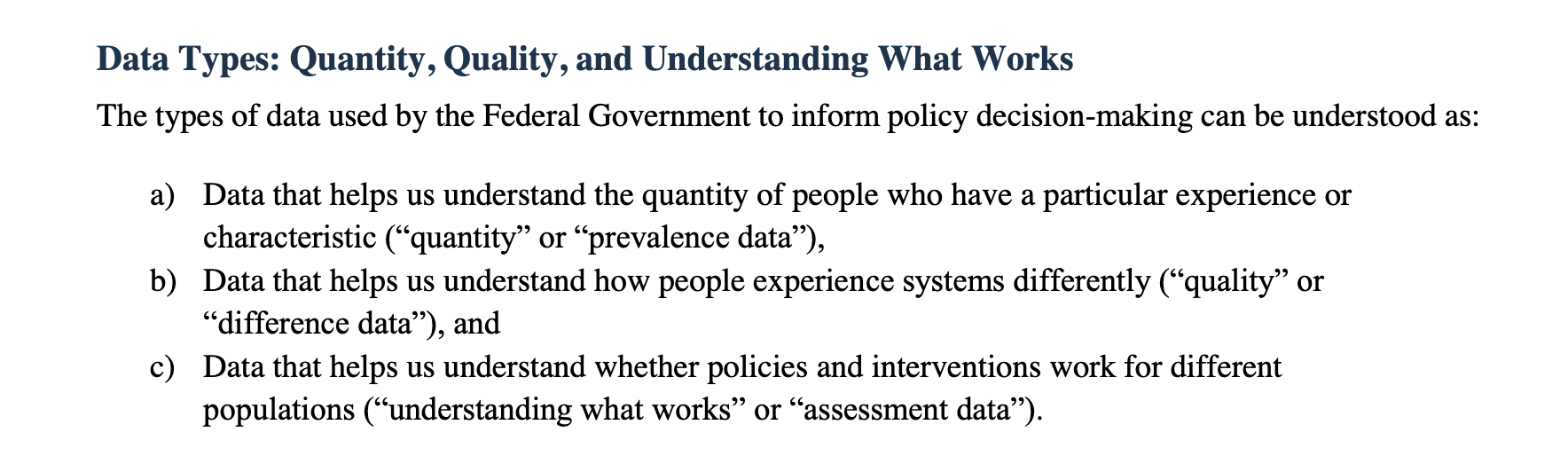
Early on, the report offers a taxonomy of data types. First, there’s “prevalence data” which establishes a sense of how many LGBTQI+ people there are in any given time and place. Next, there’s “difference data” intended to highlight the distinct experiences of queer folk and the challenges they face. Finally, there’s “assessment data,” which is (ideally) where you look for clues on how to make systems and policies that actually work to improve those experiences and overcome existing challenges.
Prevalence data is literally fundamental. It’s essential to know how many queer people there are if one hopes to make reasonable comparisons, to calculate rates per person, or to use sampling techniques for focused investigations.
In my response to the subcommittee’s initial call for comments, I argued that the decennial census needs more robust SOGI questions because of its key role in establishing prevalence baselines:
Visibility in the census is of paramount importance precisely because it also enables further statistical investigation. Census data provide the reference frame for representative sample surveys, for instance. Better SOGI census data will allow for other SOGI surveys to be run at smaller scales that limit the number of people whose days are interrupted to answer questions that can feel invasive and also to limit the amount of sensitive data collected about individuals.
As the report moves to “difference data,” it makes the case for looking at LGBTQI+ status as a variable by calling attention to a startling example. The authors cite a study showing that in the US “40 percent of those young people [under 18] experiencing homelessness identify as LGBTQI+—a much higher rate than estimates of prevalence in the general population.” I did not know that. But now that I do, I certainly agree it would be wise to adjust our responses to homelessness among young people.
Next, the report argues for “prioritizing assessments of programs and services for LGBTQI+ people in areas where known disparities exist, such as in education, housing, caregiving, employment, immigration, and military life.” It continues by noting that “Many of these assessments will rely on administrative data.”
It seems hard to argue with the goal of finding out what policies are working well for queer people. But “assessment” makes me queasy (like “efficiency”), probably because it has so often been tied to efforts to cut or constrain—and because things that are hard to assess with data can then become vulnerable.
An anecdote from Ellen Ullman’s Close to the Machine comes to mind here. Ullman, a computer programmer and essayist, signs up to help a nonprofit build “Jerry,” a system intended to make it easier to coordinate care and service provision for AIDS patients. It turns out to be a disconcerting experience.*
“Two months into the planning of the second phase, the project took a distinctly ‘bad’ turn,” wrote Ullman. “The director of the department began asking for links between client registration data and other city systems.” The administrator hoped to use the data to measure efficacy and cut slack from the system. Ullman thought there was value in the existing imprecisions that ought to be maintained:
“How would it help clients if Jerry told her that this particular underfunded agency should be even more underfunded?…How would it help if, in the awful and explicit way of computer systems, Jerry made clear what everyone knew—that there was a little fudging going on around the edges, so that providers could get a little extra and give a little more. In the absence of the machine, everyone could wink at these small rough edges.”
So, I guess I’m arguing for assessment in the spirit of maintaining some useful slack.
The final thing I’ll say about the report pertains to its approach to the problem of getting good statistics about small-ish communities. By “good statistics” I mean numbers that are useful and not too misleading: that requires a certain amount of disaggregation. Lumping together all LGBTQI+ people ends up hiding variations that can be crucial. But the more one disaggregates a data set, the more likely that the analysis will reveal confidential, individual data (which is a bad thing) or will fail to benefit from the law of large numbers (and so the results might not be reliable).
The basic solution, as the report explains, is to make the sample bigger: if one narrows a dataset to look solely at the experiences of non-binary people, for instance, then one may need to look at a greater window of years or include a larger geographic region. As the report puts it: “To address the limitations of small population data, multiple agencies and data sources collecting similar information at varying time intervals, granularity, and geography may need to pool data to allow for more accurate analyses and interpretation of results.” The authors draw inspiration from strategies employed to conduct disaggregated research among similarly prevalent groups within Asian American and Native Hawaiian and Pacific Islander communities.
It is, as I said, a more interesting report than I expected. I’ll close this section by looking back at that Ellen Ullman example, though, just to note that more data to highlight problems becomes useful when our society also agrees to devote more resources to addressing those problems. Shrinking the pie or even just maintaining it—whether that pie is the amount of affordable housing or access to healthcare or education—can undermine the power of gathering good data in the first place, and the data itself can end up as a tool employed to further trim away much needed slack. We have to ask for better data at the same time we push for a new, green, and inclusive deal for our society.
In my #NYCPride celebrating, I also picked up an article I had been meaning to read for a while, by one of the most important and original voices among historians of computers, Mar Hicks. In a 2019 article, “Hacking the Cis-tem,” Hicks explained how their diligent FOIAing of British government pension-office documents had revealed a very early example of what we now call computerized algorithmic bias. The targets of that bias were trans Britons, who in the 1950s and 60s had negotiated a kind of deal with the pension office: if they agreed to a legal fiction that their birth certificates had simply been marked erroneously and won the support of some key witnesses (including usually a doctor), then the Ministry would issue a new National Insurance card indicating their proper gender. It wasn’t a perfect system, but it was something.
Then came a shift to more complete computerization.
If we lean toward liberatory narratives of computing, we would expect this transition would have been a good sign for trans people. If, other the hand, we start out with Ellen Ullman’s viewpoint, then we’d maybe be a bit suspicious about what might happen when a government decides to code a workable, informal system. And that is more in line with what Hicks found: a new commitment to binary sex embedded in binary code.
In the mid-1970s, Ministry officials stopped changing gender on ID cards claiming that the new system and the computers that made it possible no longer saw gender—they claimed, therefore, that the card’s gender indication no longer mattered. (This ignored the many ways that having one’s proper gender on a government ID would matter to a person.) The new system tracked income instead, increasing economic surveillance and tying pensions to earnings (as was already common in the American social security system). Still, Hicks reported, the system did not really give up on gender. The people who programmed the computers built in exceptions that flagged every person who the government knew to be trans, requiring each to have their case dealt with manually. By treating trans folk as exceptions, the government assured extra scrutiny and made delays more likely. Computerization offered an excuse to walk back trans-accepting policies, while hiding the system’s suspicion of Britons who didn’t submit quietly to the gender binary.
Alongside that cautionary tale, Hicks pauses to reflect on something else revealed in these FOIA files:
There were large enough numbers of trans Britons asserting their rights to the benefits of the new welfare state to be taken for granted as a class of citizen-users, had the state chosen to see them as such. Indeed, these files may contain some of the earliest examples of how trans citizens began to emerge as a specific cohesive class arguing for their rights in British society in the 20th century. (29)
Here is an inspiring point. No one wants to spend time fighting to get their name or gender corrected in a pension ledger—that so many people did so is a testament to their resolve, and an expression of queer activism that deserves our celebration.
FURTHER READING:
- my one-time, beloved officemate at the MPI in Berlin, Sandra Eder, wrote “How ‘Gender’ Went Rogue” for Los Angeles Review of Books, an essay based on Sandra’s book How the Clinic Made Gender.
- last August, WIRED excerpted part of my chapter on “partners” in the census from Democracy’s Data in an essay titled “How Does Queerness Fit Into US Census Data?”
*NOTE (appended on July 6, 2023): I was using the first Picador paperback edition when I wrote this post. When I got my copy of the new MCD/Picador 25th Anniversary Edition, I saw that the name of the system had changed to “Reggie”: “Reggie. Also short for registration.” My guess is that that the original name had been changed for some concern about privacy in earlier editions and is now, many years later, being revealed.